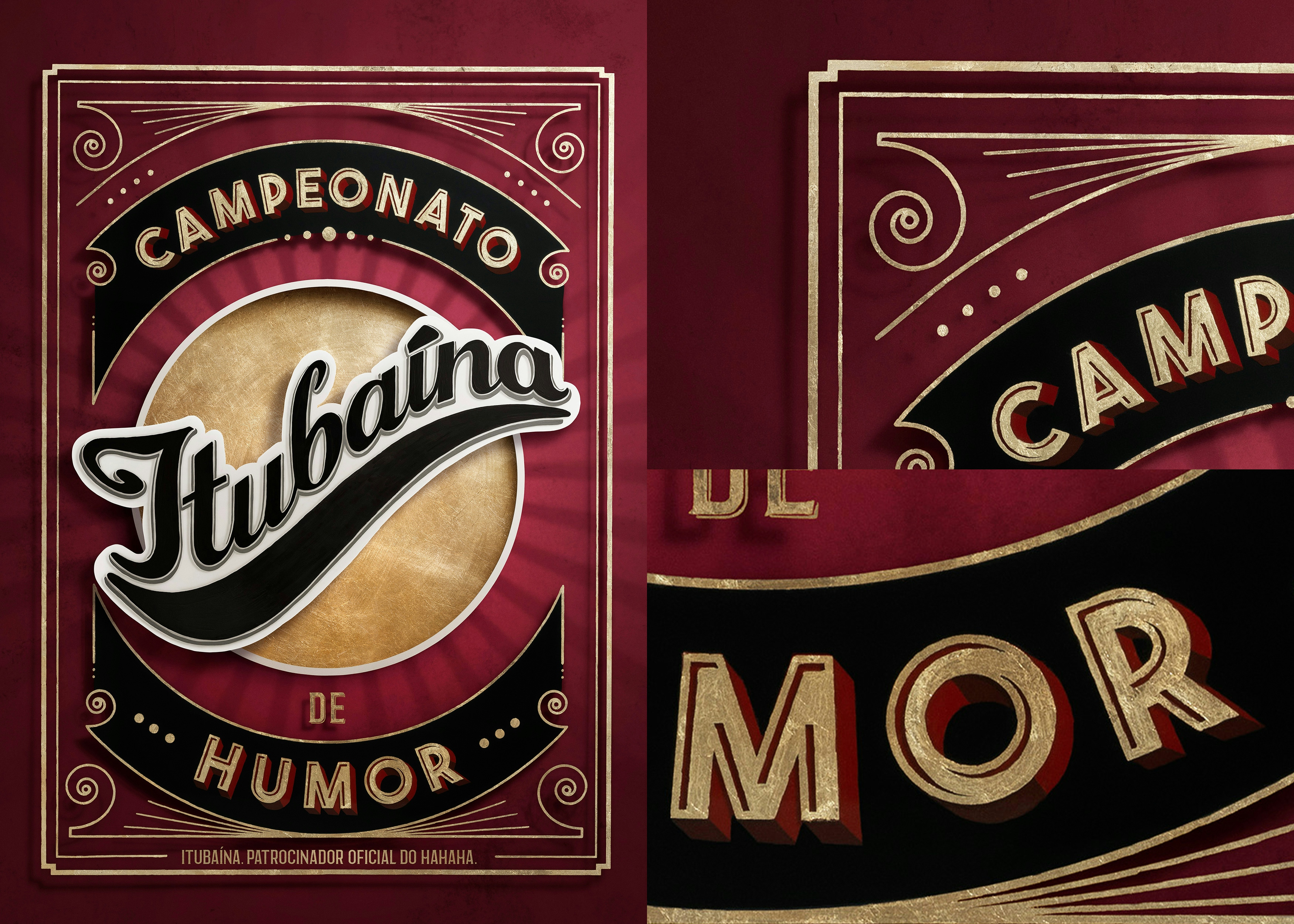
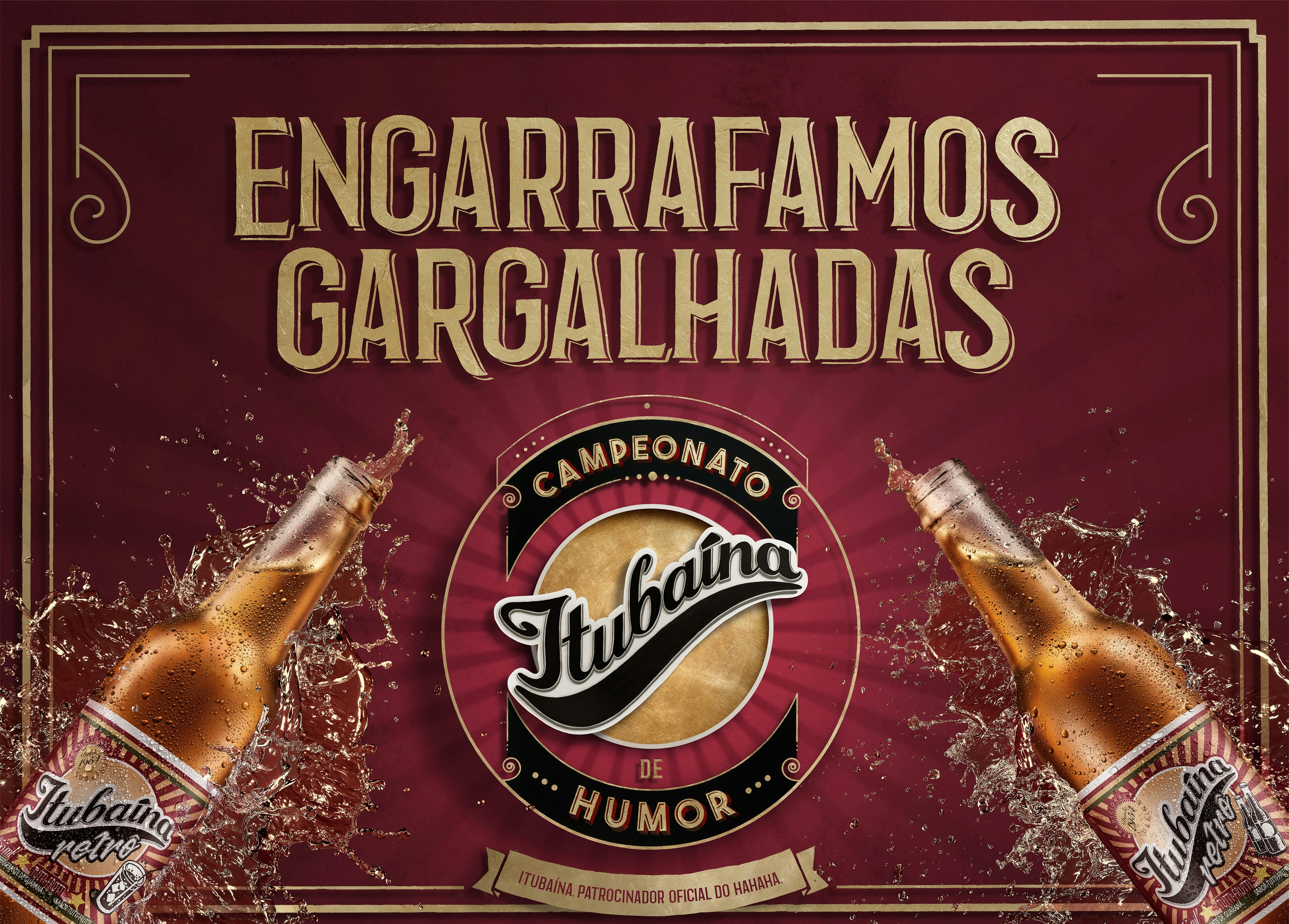
ITUBAÍNA|HUMOR CHAMPIONSHIP
+DRINKABLE
+TACTILE
JOIN US


At each project, we aim to achieve a truly distinct result, whether it's aesthetic, in terms of production, or through our engagement with the idea and the brand's concept. Ultimately, it should bring pride to all the teams involved.
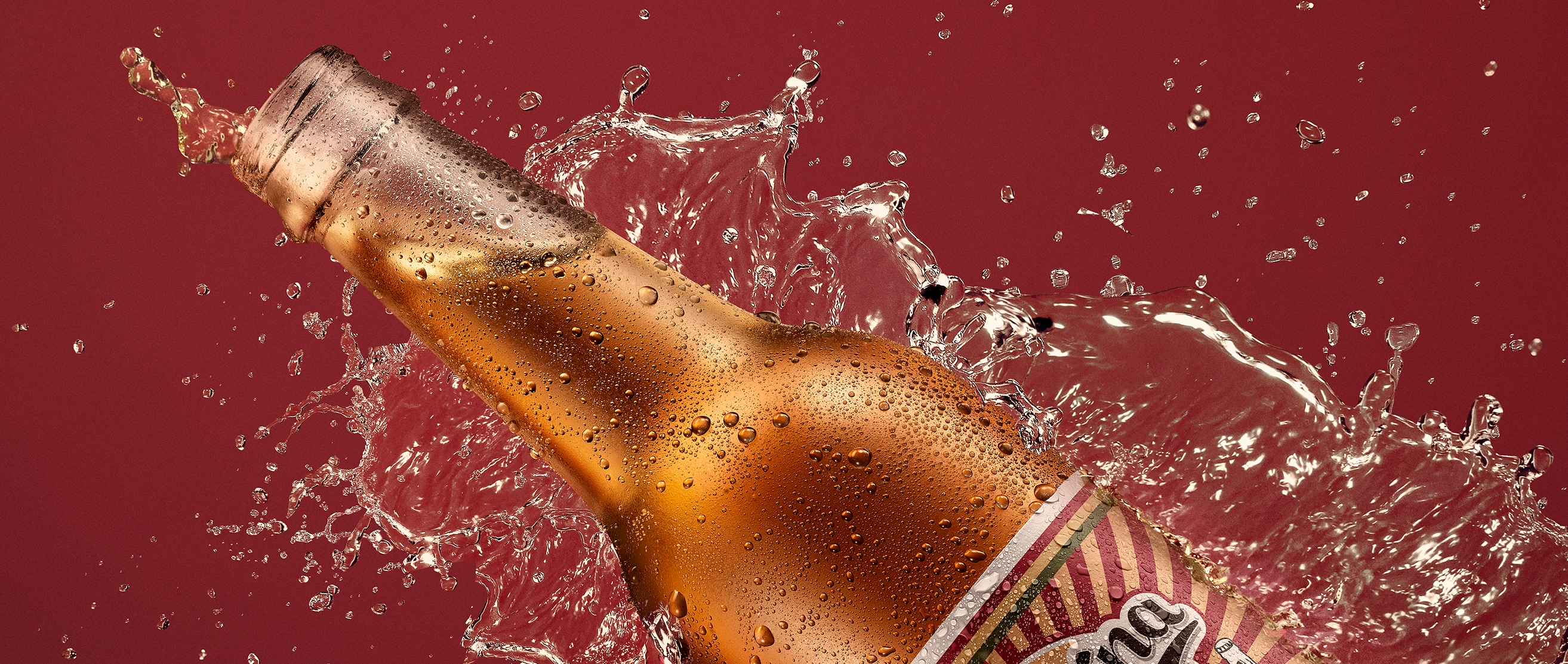
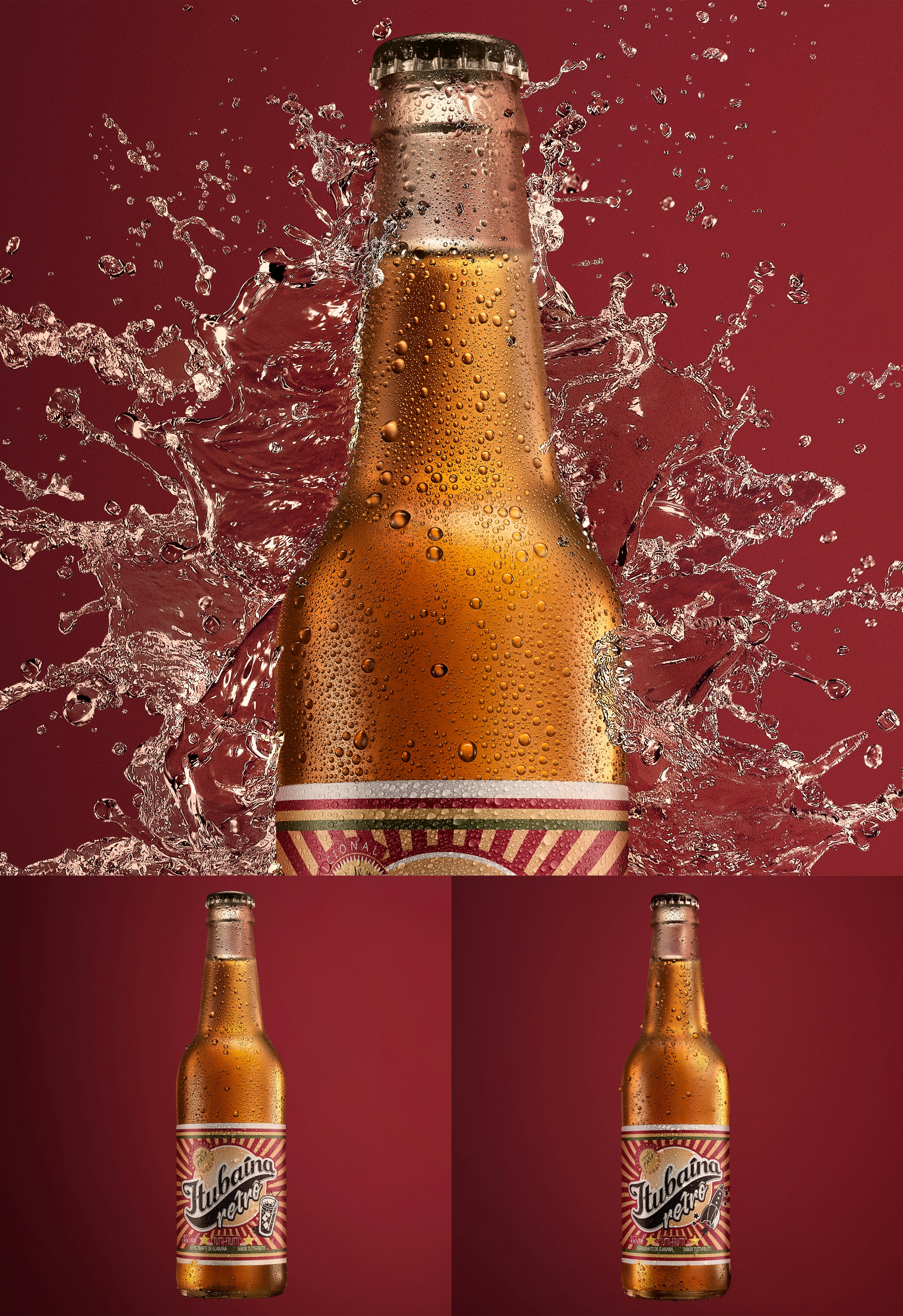
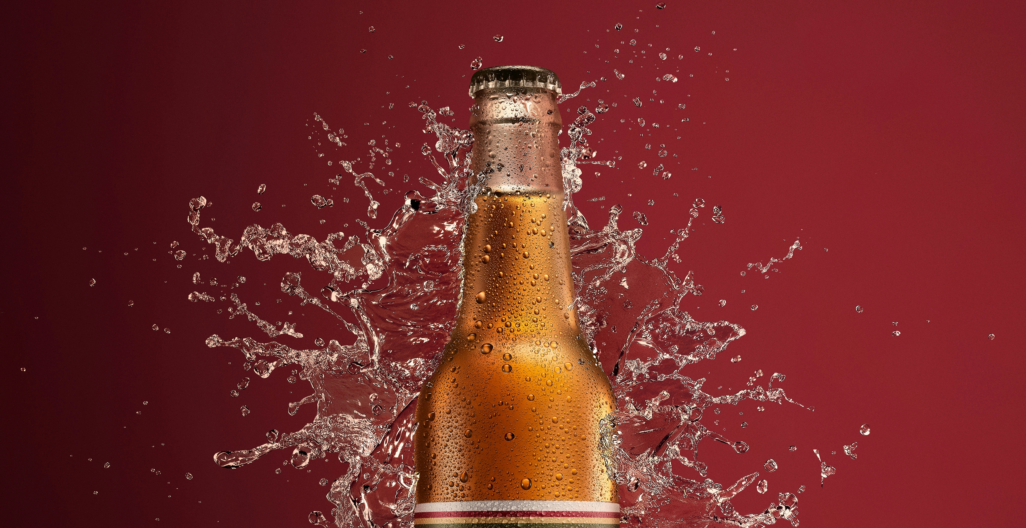
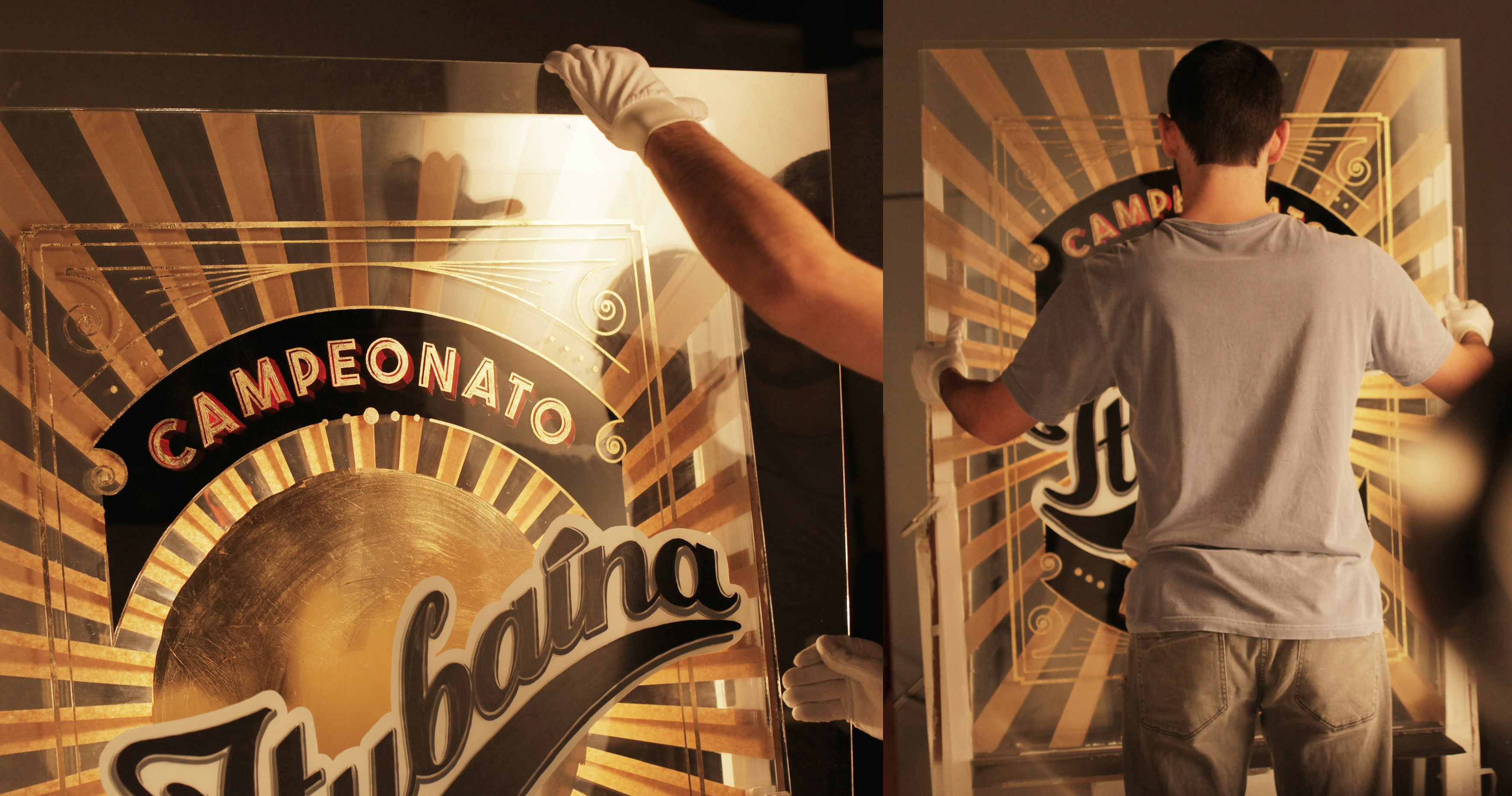
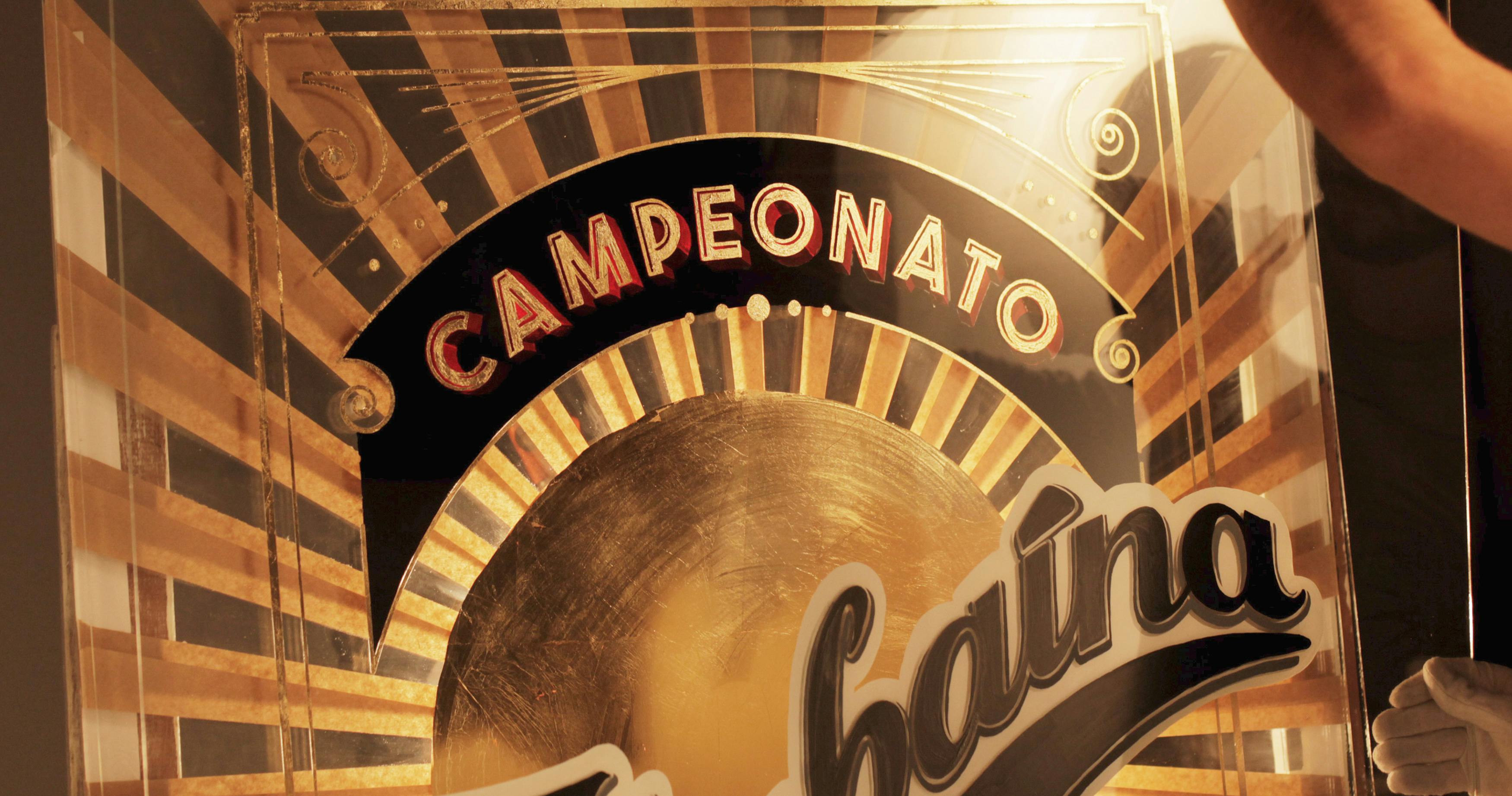
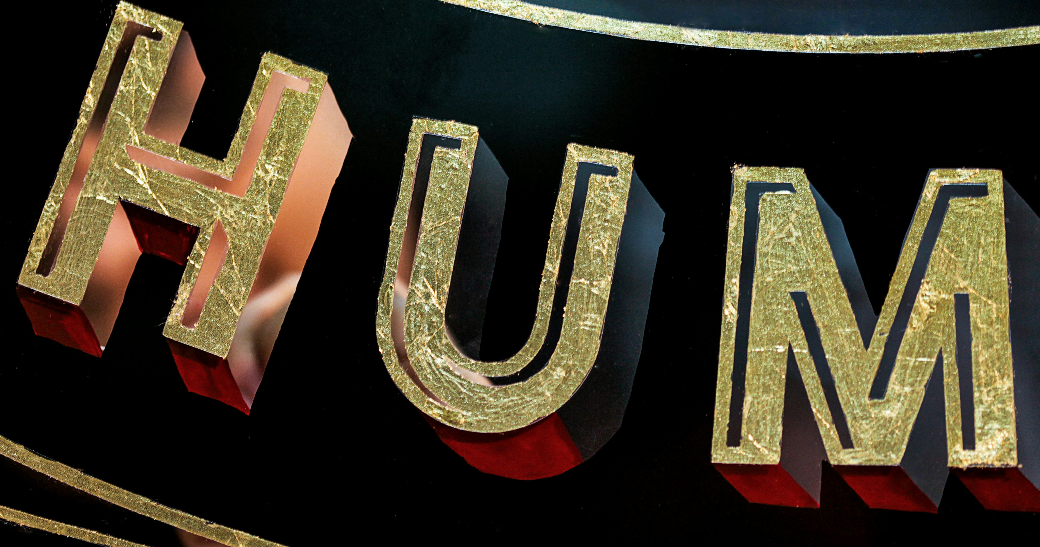
The invitation prompted us to bring a visually impactful language to a very traditional brand in Brazil like Itubaína. Consequently, we were immediately led down a path that emphasized this strong tradition. We combined the brand's concept with the artisanal production of the pieces, bringing together a retro circus language and a touch of Art Deco using gold leaves, glass, another layer of glass, typography, and lights—all within a single installation.
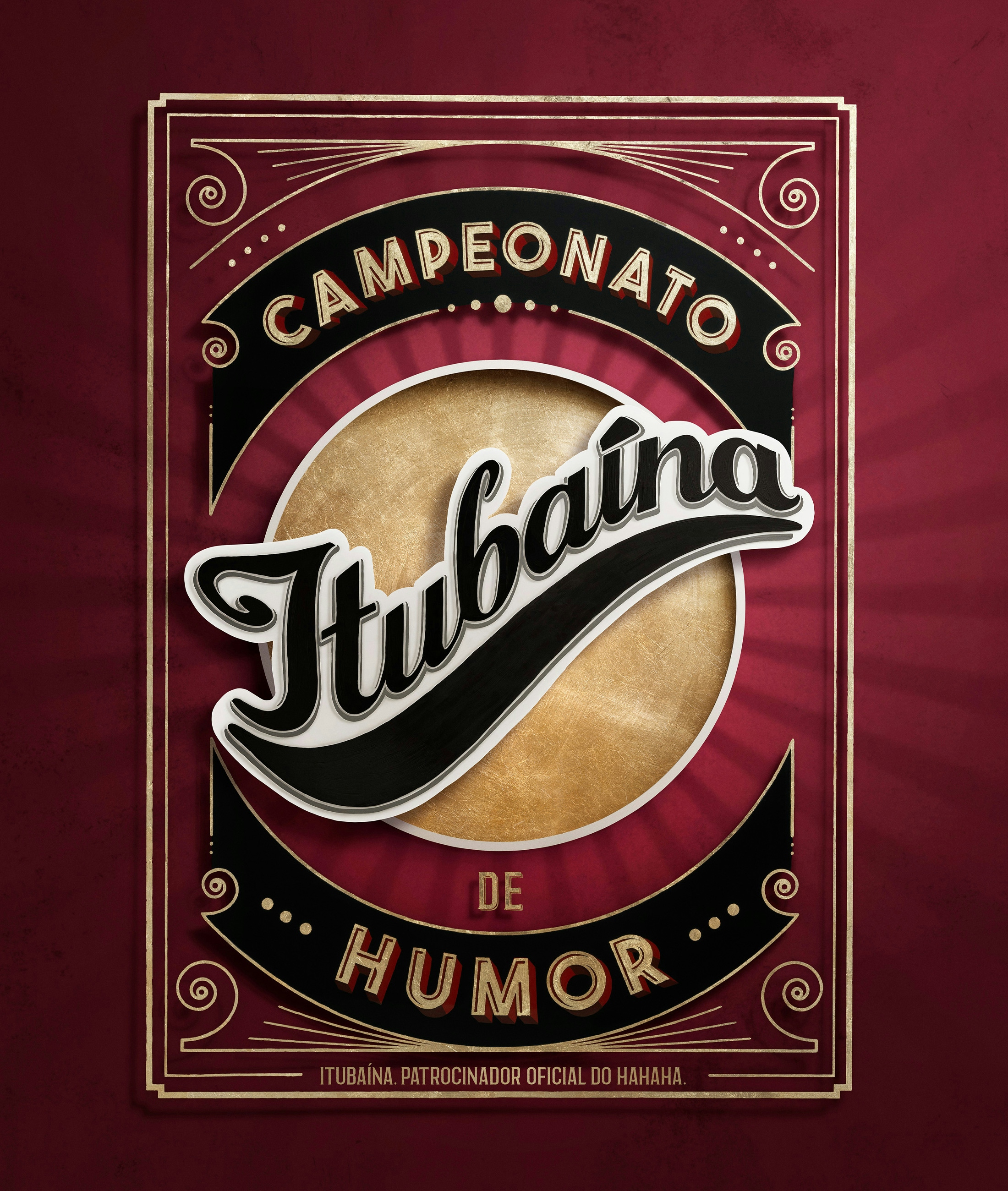
PHYSICAL GLASS LAYERS
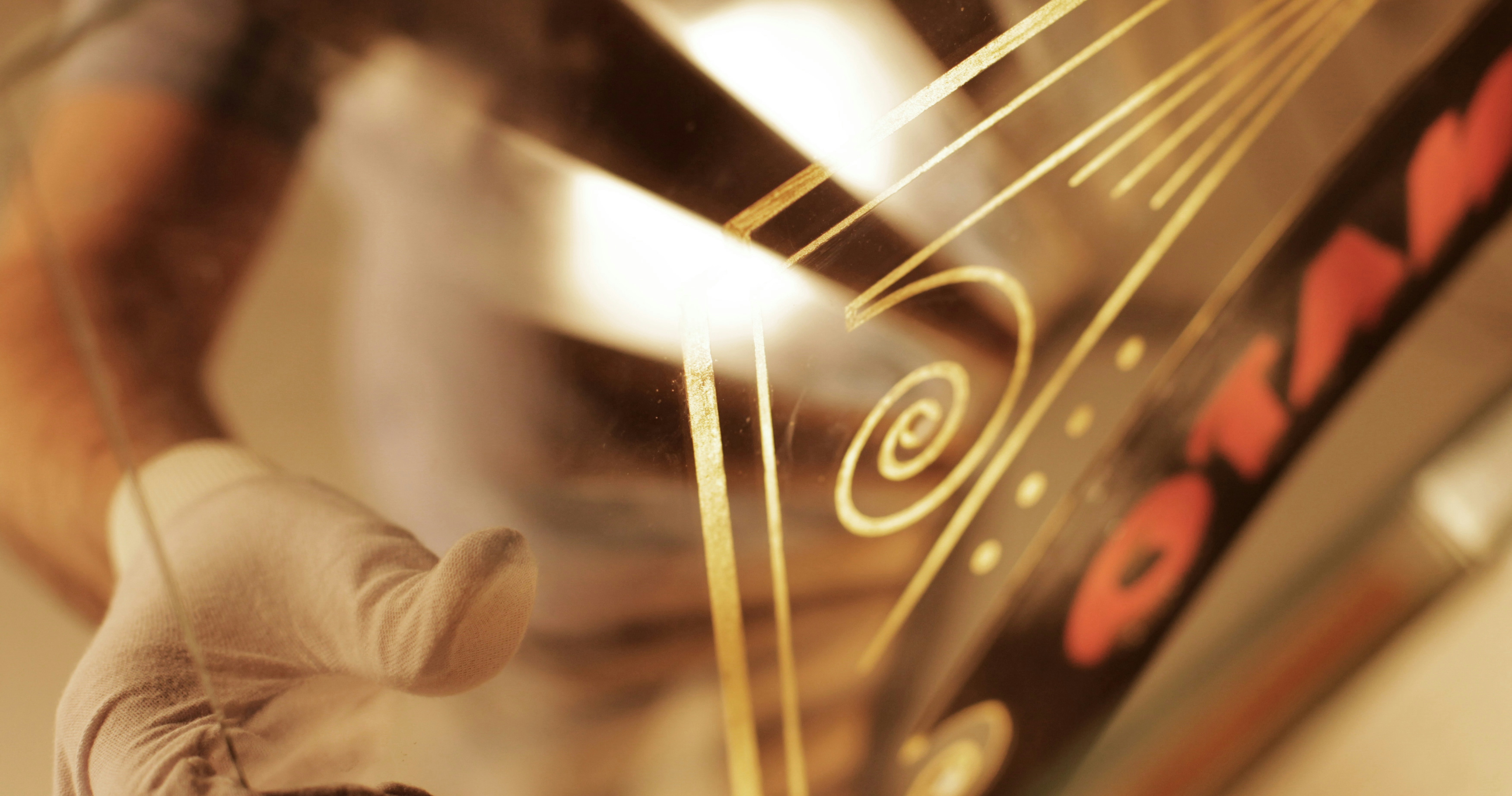
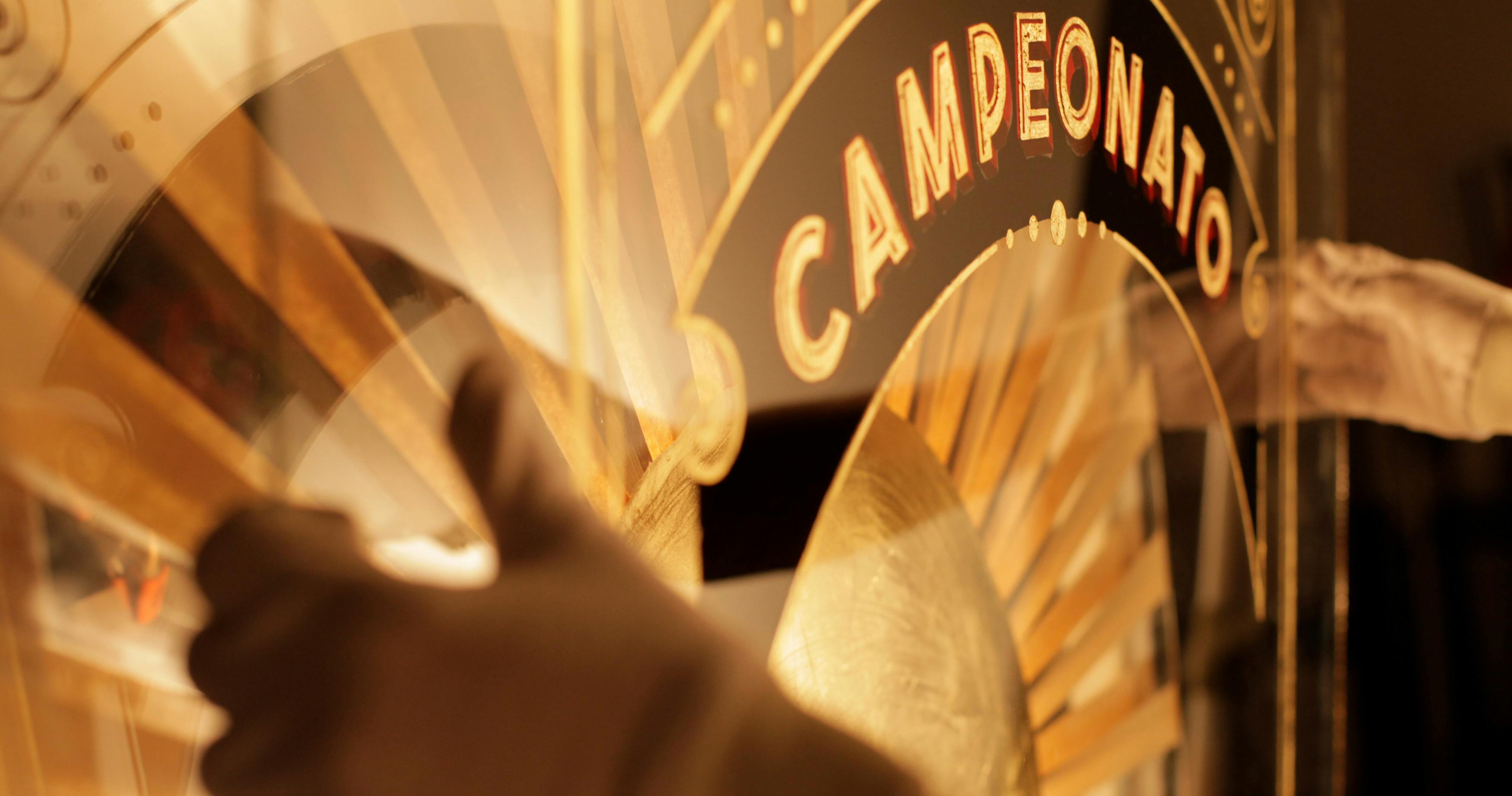
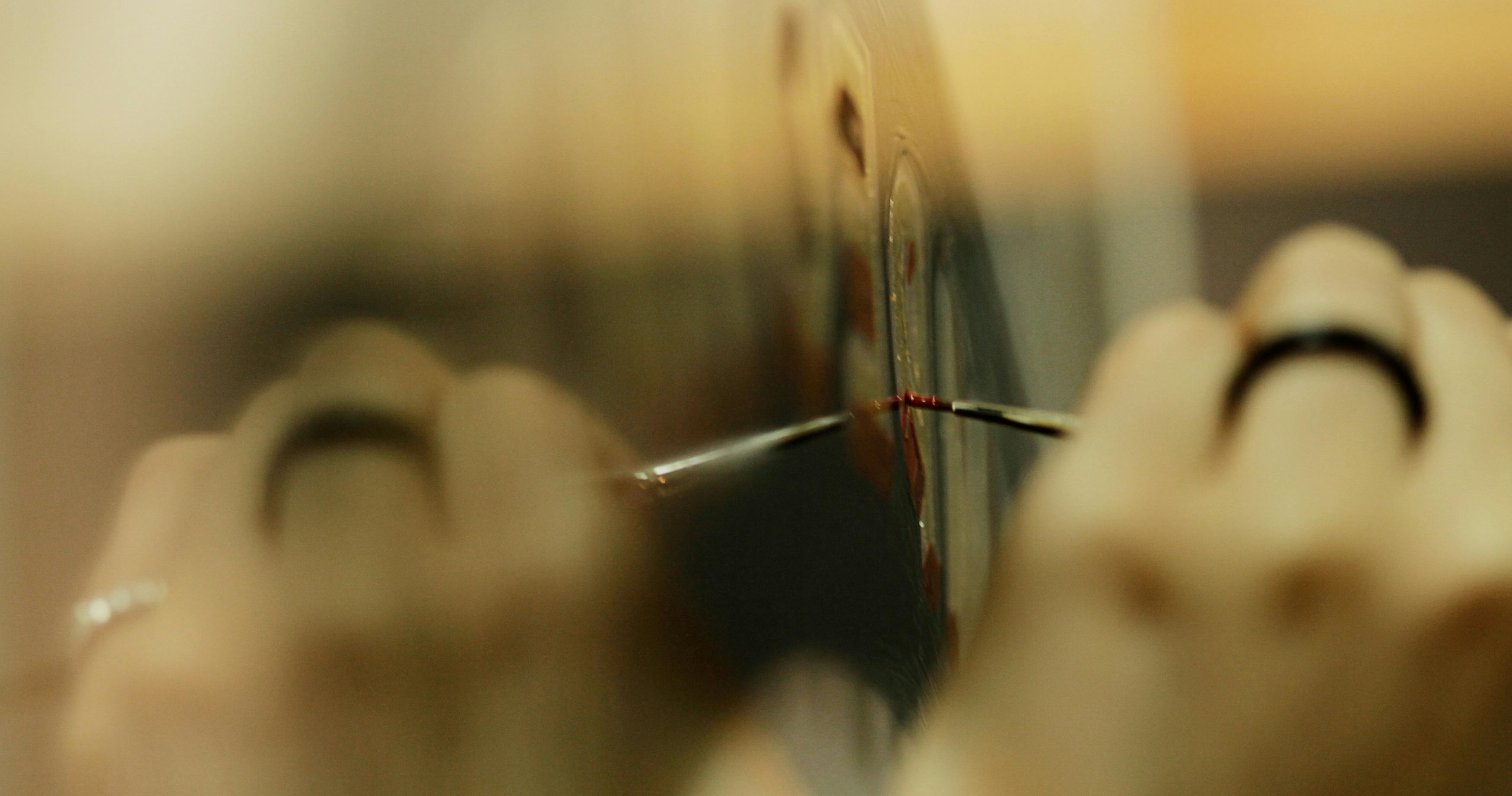
The construction of the images in this campaign was planned to emerge from an installation. Each play of light, the projected shadows, everything results from a combination of layers of paint on different glasses and the lighting designed for the camera lens.
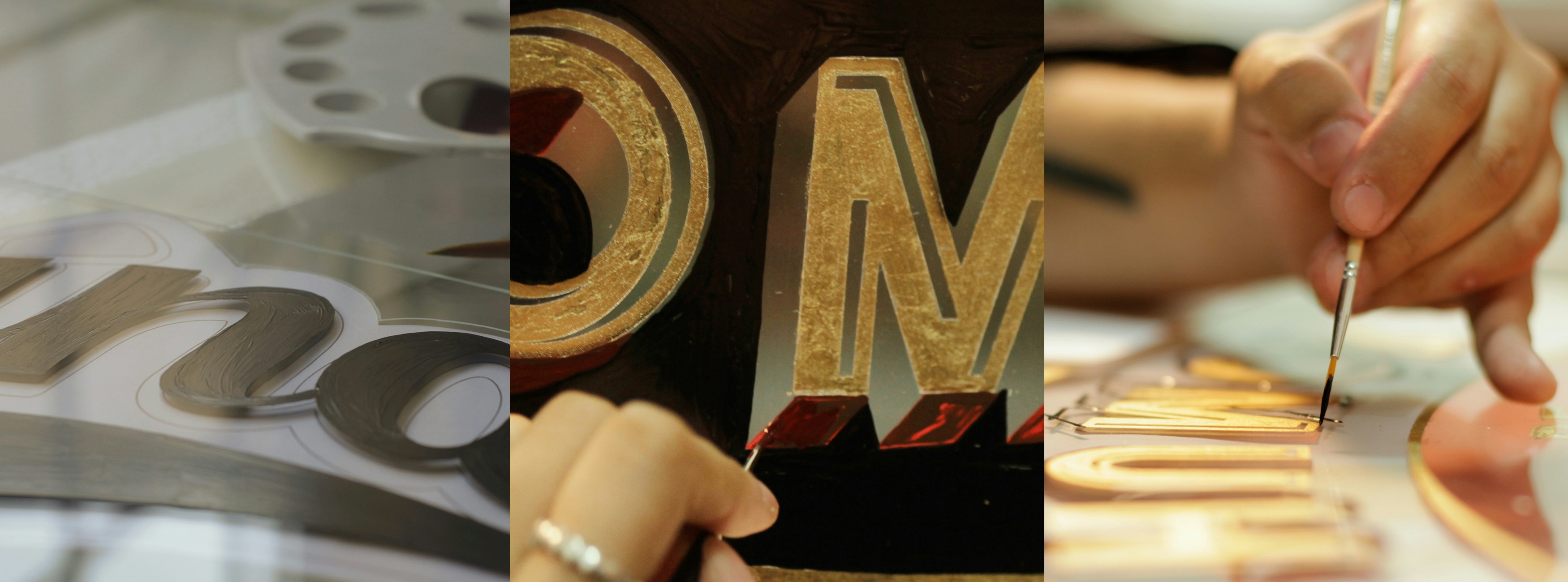
INSIDE THE PRODUCTION
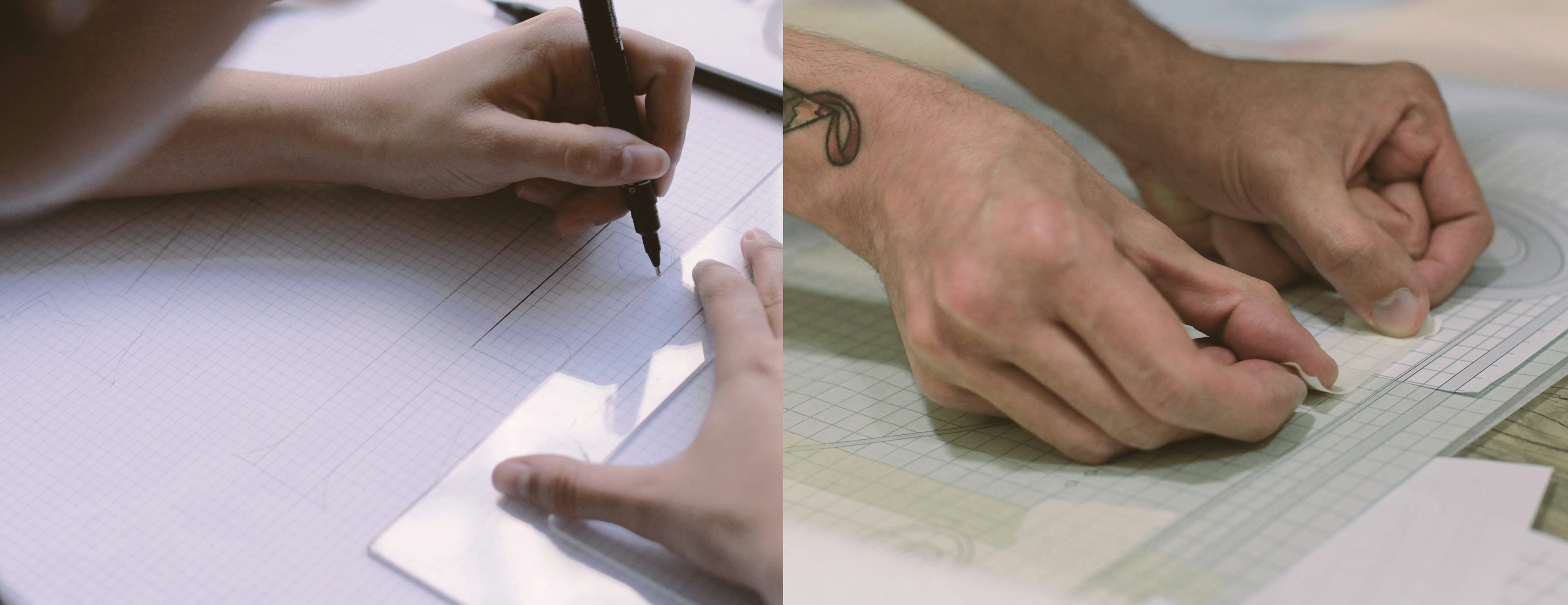
After understanding the entire production dynamics and testing it with prototypes, we proceeded to the actual production of each layer with paint and gold leaves.

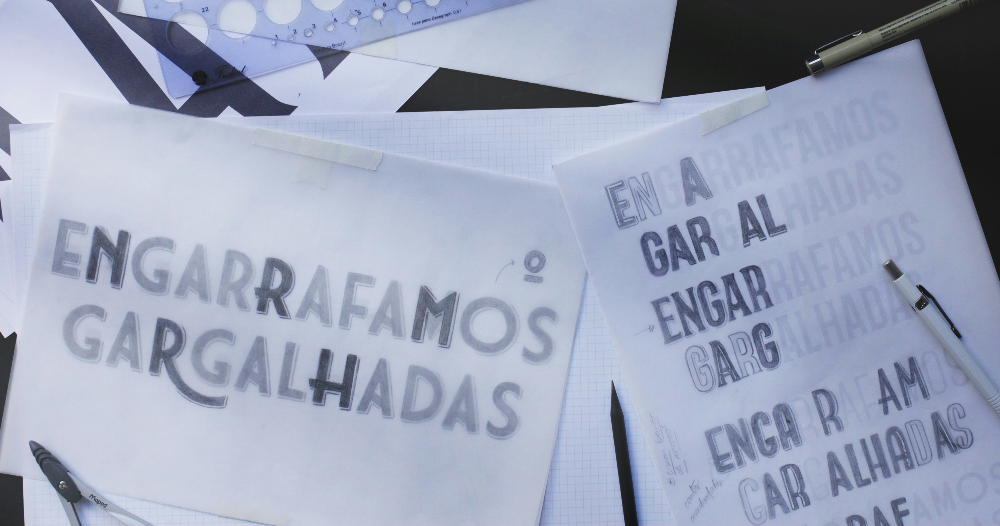
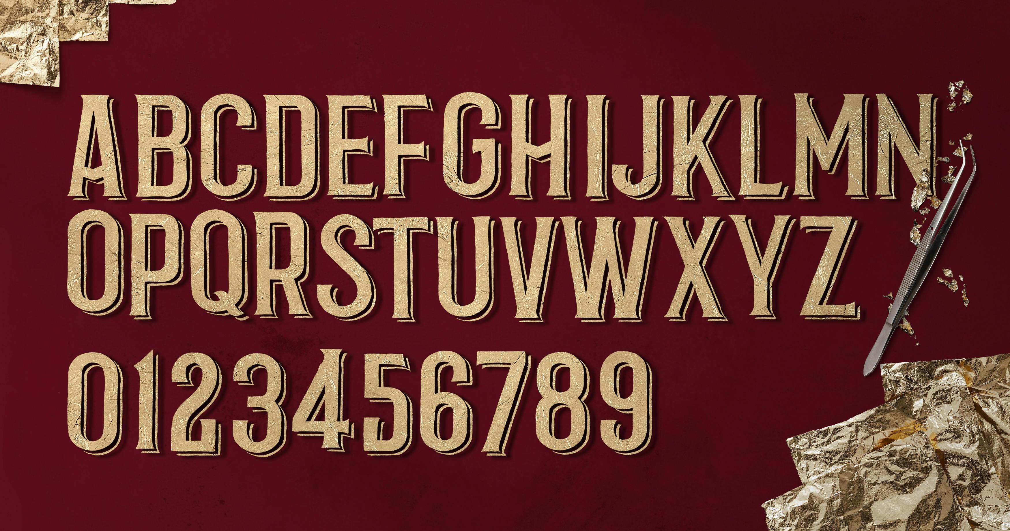
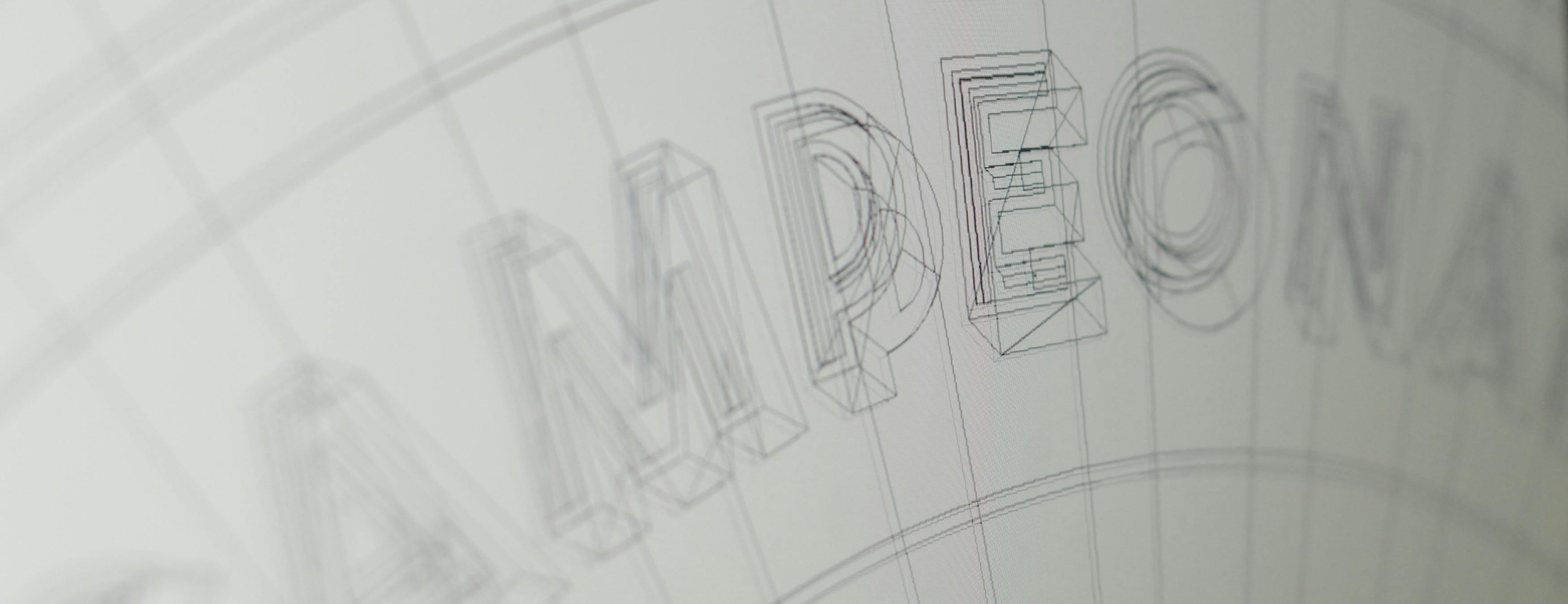
LETTERINGS AND
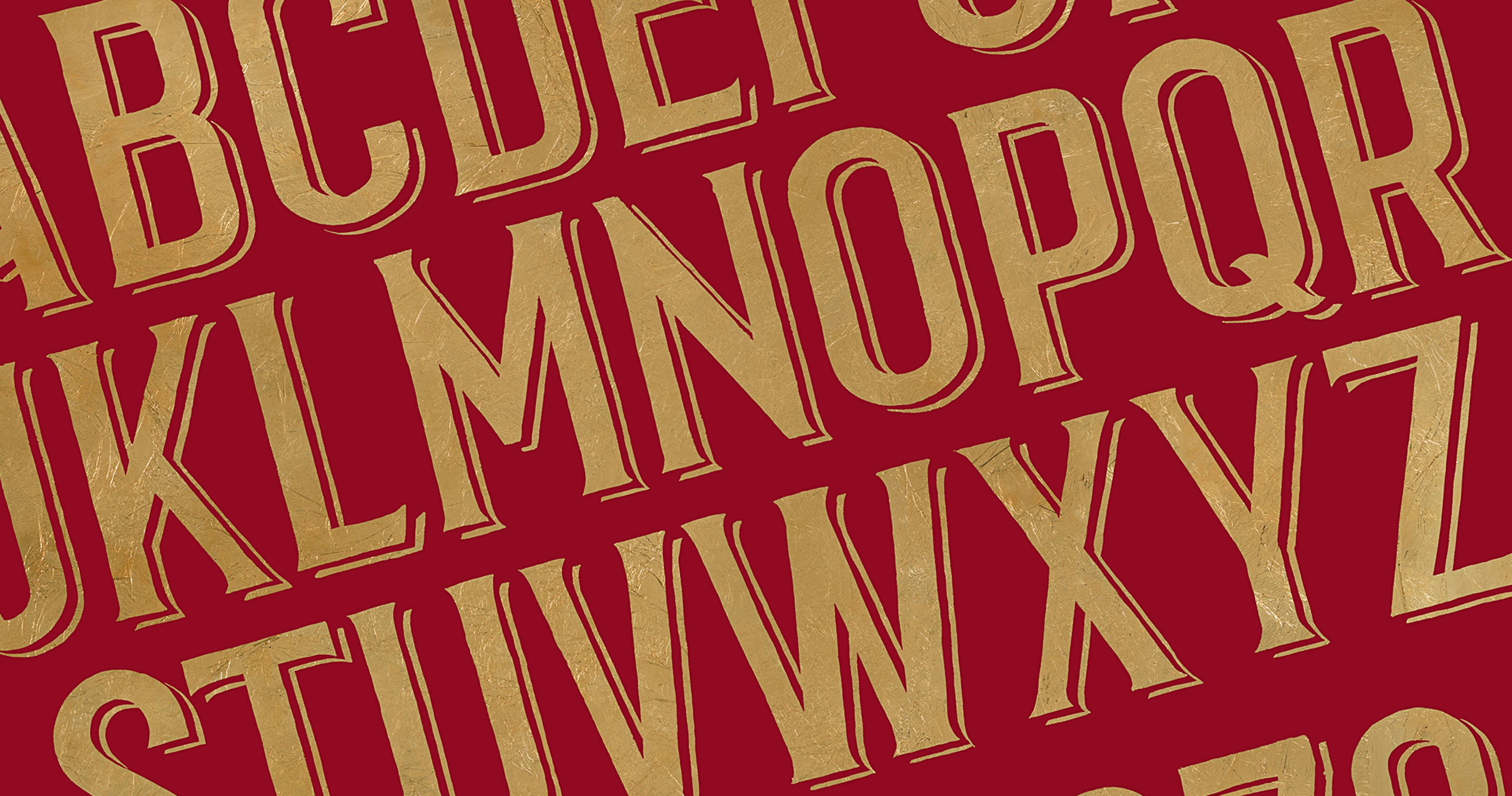
A GOLD LEAF ALPHABET
The central part of this project involves the typefaces chosen to continue the campaign execution. As always, we begin by researching and conducting tests to gain confidence in the path we are going to follow. One of them followed a path with more Art Deco characteristics, and the other had more classical features, such as well-designed serifs.